
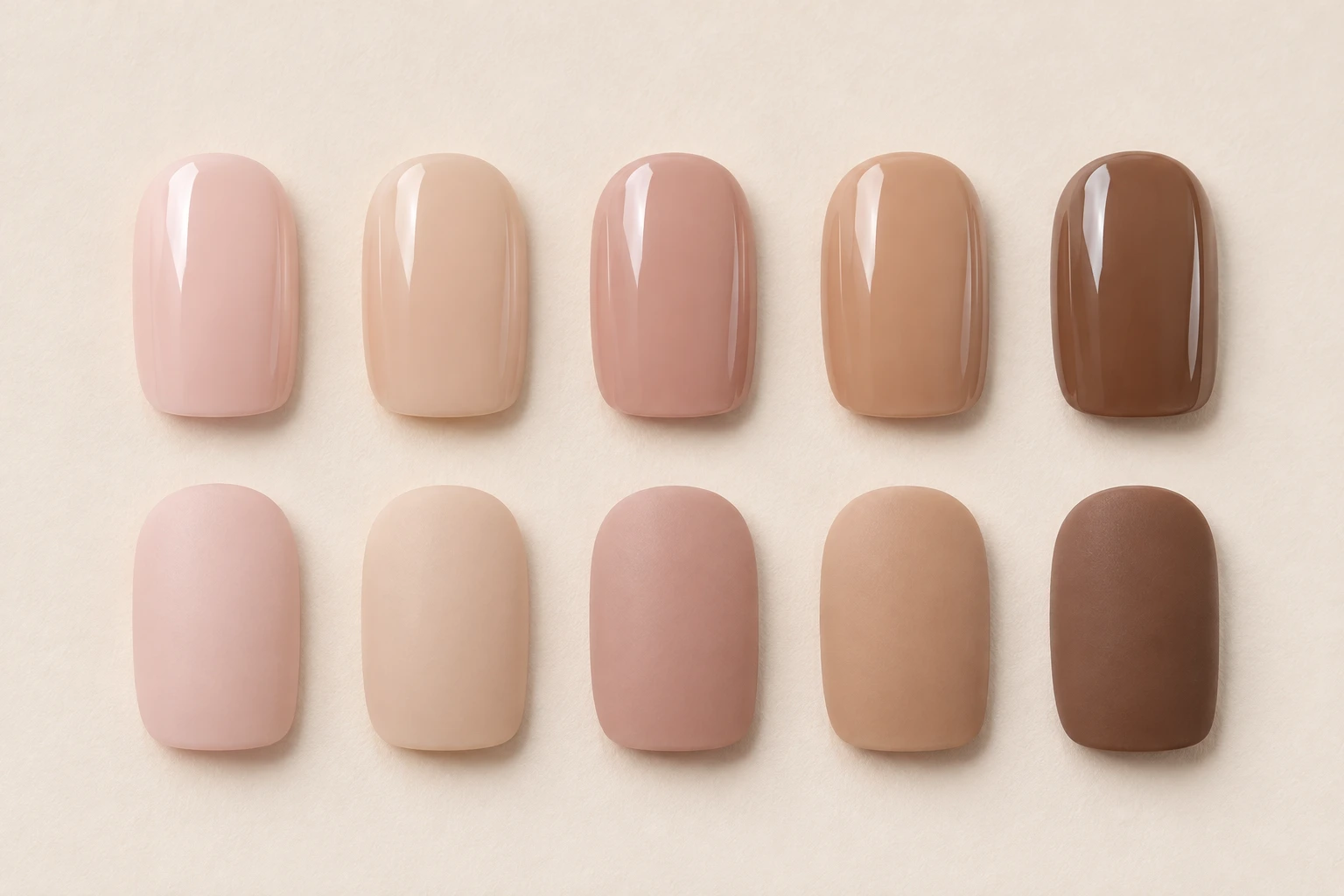
A nude nail color can blend with your skin, echo the pink of your nail bed, or create a soft contrast. Decide which effect you want before looking for a shade. There is no single nude that everyone needs to match, and a color can be a good choice even when it is visibly lighter or darker than your hand.
Start with the whole look: the color, how much it covers, and its finish. A sheer pink and an opaque pink with a similar name can give very different results.
Start with depth
Depth means how light or dark the color appears. Hold a sample near your fingers, if one is available, and ask whether you want it to blend in or stand out. A pale beige on a deeper skin tone creates contrast; a rich brown can do the same on a lighter hand. Neither choice needs correcting.
For a subtle result, compare shades around the depth of your skin rather than assuming the palest option will look most natural. Look at the color beside several fingers, since your palm, knuckles, and nail beds do not all have the same color.
Compare pink, yellow, and muted tones
Within the same depth, some nudes lean pink or rosy, others peach, golden, or brown. Some look muted and grayish. These differences can be more useful than a broad label such as warm or cool.
If one shade seems unexpectedly orange beside your hand, try a less peachy version at a similar depth. If another looks chalky, compare a deeper or more translucent option. Change one feature at a time so you can see what helped. You do not need to assign yourself a permanent undertone category first.
Check coverage and the free edge
A sheer nude allows some of what is beneath it to remain visible. Your natural nail, the white free edge, and the adhesive can therefore affect the finished appearance. An opaque nude hides more of that variation. Ask for a worn photo as well as a loose nail photo when coverage is difficult to judge.
If you want an even color from cuticle to tip, look for an explicitly opaque finish. If you enjoy the visible character of your natural nail bed, a translucent option may be closer to your goal. Neither description identifies the material used to make the press-on.
Compare in more than one setting
Check your shortlist near a window and under the indoor lighting you use most. Keep the background simple. Moving from a warm room light to daylight can make a color feel different, so a single dramatic photograph is a poor basis for an exact match.
For online shopping, compare several views from the same listing and read the shade description. Your screen cannot promise an exact physical color match. A photograph on a hand with a similar skin depth can help you imagine contrast, but lighting still matters.
Choose the version you will enjoy wearing
A glossy finish makes bright reflections conspicuous; matte looks quieter and more diffuse. Length and nail shape also change how much of a color you see. Compare these details before ordering a second shade solely because the first photograph felt too bold.
If you are choosing between two close nudes, write down the difference you actually want: more pink, less opaque, slightly deeper, or less shiny. That is a much clearer shopping brief than trying to find the one universally perfect nude.